
Studies of Yellow: Ochre
Why we’re drawn to it
Before indigo or crimson, there was ochre. It was the first paint color used by humans, ground from earth and brushed onto cave walls. Thousands of years later, it remains in every artist’s palette, still speaking the language of soil and sun.
Ochre carries the warmth of sunbaked earth and a quiet, grounding depth. There is comfort in it and a connection to something ancient. It works best when it feels found rather than forced. It should feel unearthed, as though it naturally belongs in the space.
How to use it
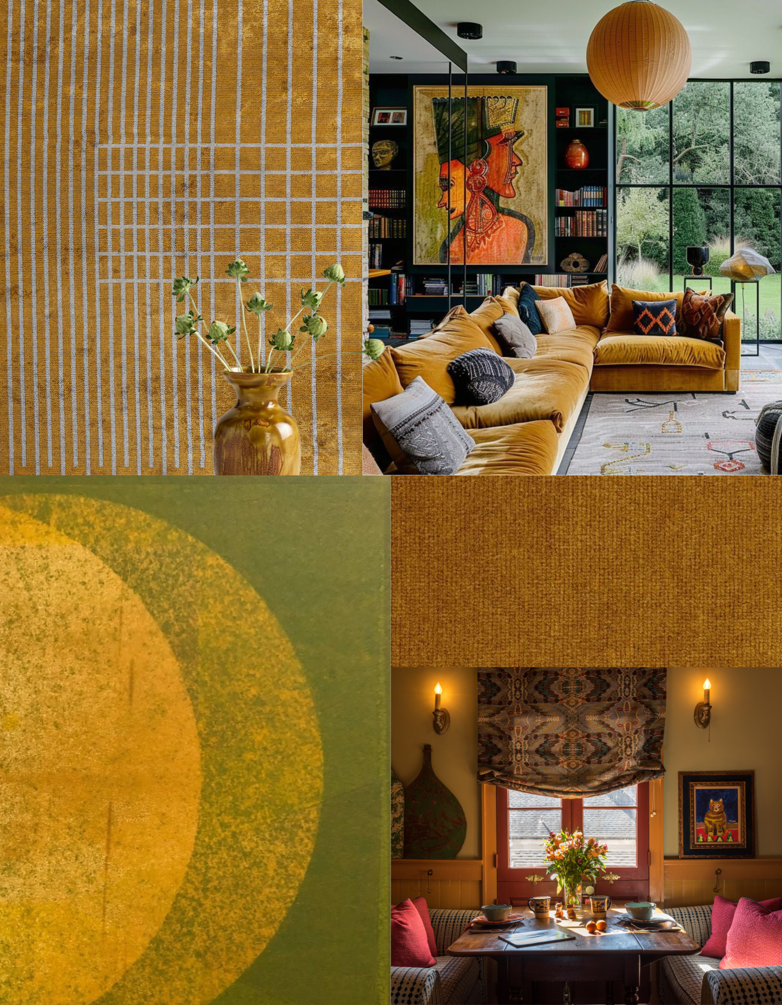
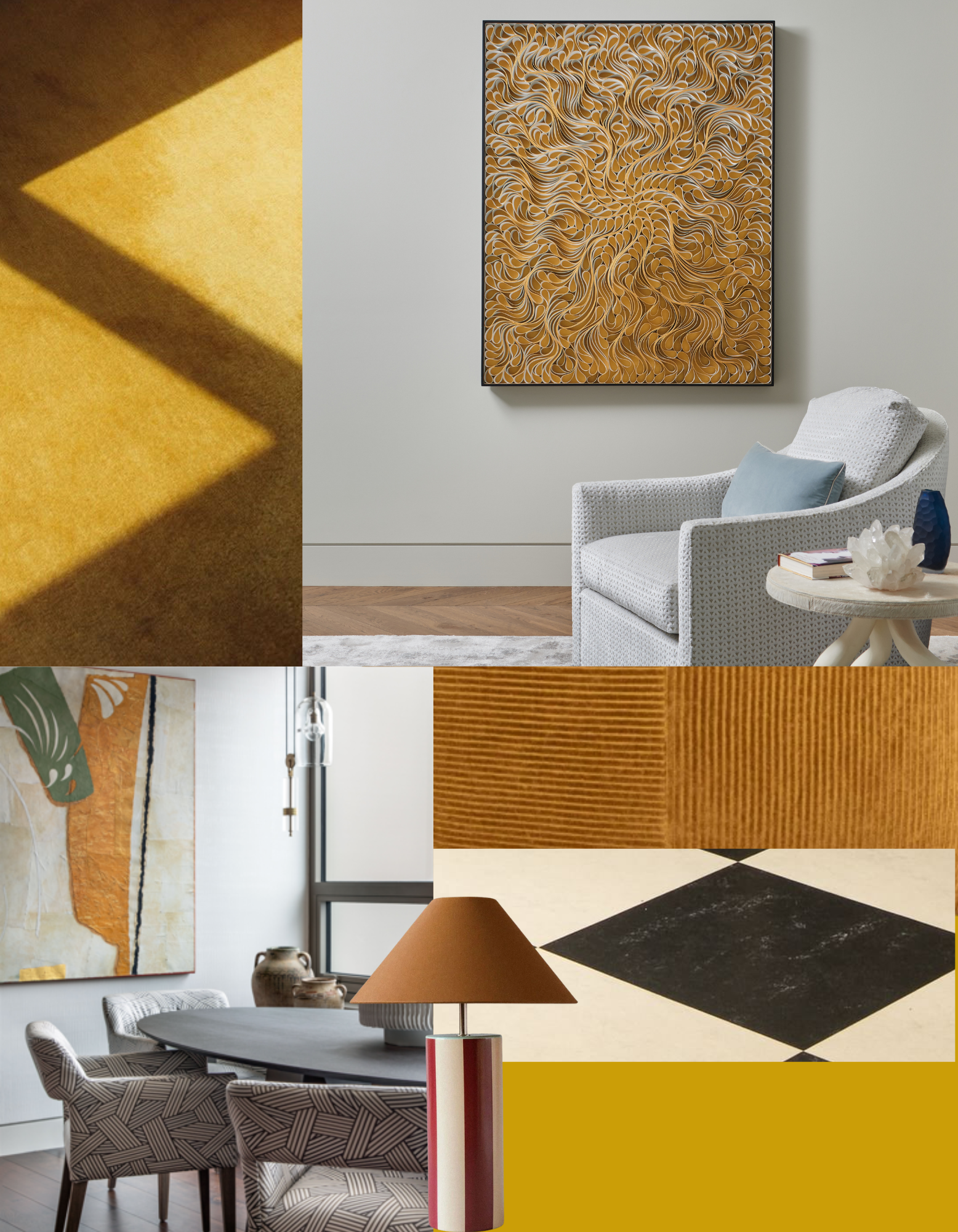
Ochre is a versatile, earthy yellow gold pigment that adds warmth and sophistication to interior spaces. It works beautifully as both a bold statement and a neutral backdrop.
Incorporate it through upholstered furniture such as a velvet sofa, introduce it on an accent wall, or layer it in through textured textiles.
Pair ochre with natural materials like wood and stone for an organic feel. Contrast it with rich jewel tones to create a balanced atmosphere.
