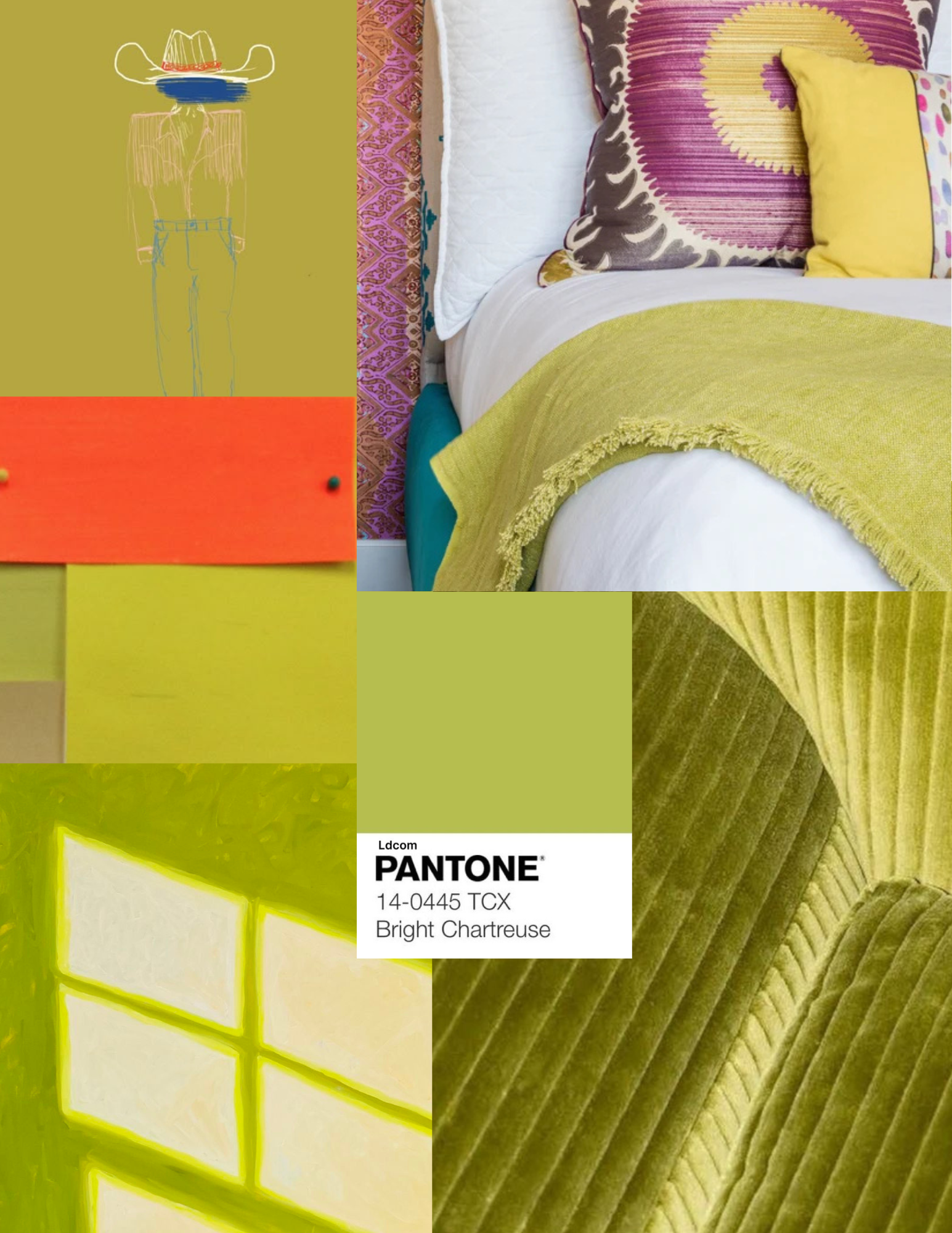
Studies of yellow: Chartreuse

Why we’re drawn to it
Somewhere between green and yellow, chartreuse is equal parts electric and natural, modern and timeless. It feels bold and innovative.
We love it for its duality: vibrant yet organic, playful yet sophisticated. Chartreuse is psychologically linked to energy, growth, and vibrancy. It catches the eye quicker than most hues.
A pop of chartreuse upholstery or an accent wall can instantly modernize a room. Against neutrals like charcoal, beige, or soft gray, the color bursts to life without overwhelming the space.
How to use it
Pair with neutrals for balance.
Let it shine as an accent color in artwork.
Embrace it fully and paint an entire wall if you want boldness and originality.
